
UX Design: App
Muerte & Tacos
/ dedicated ordering app
The challenge for this project was to design an app with a prompt from a randomized generator - I received “ordering app for a food truck.” From here I developed the app and brand for Muerte & Tacos, a fictional artisanal taco truck in London Ontario. The app was created to allow customers to order delivery and pre-order pick-up so that they can easily satisfy their taco cravings, even when on a tight schedule.


THE PROBLEM & GOAL
The issue this app was aiming to solve is that young professionals and young families lack the time to prepare meals and want the option to order in or pickup food on the way home, in a timely and cost efficient manner.
The goal was to design an easy to use, eye catching app that allows users to order fresh meals for delivery or pick-up easily and quickly.
TARGET AUDIENCE & CHALLENGES
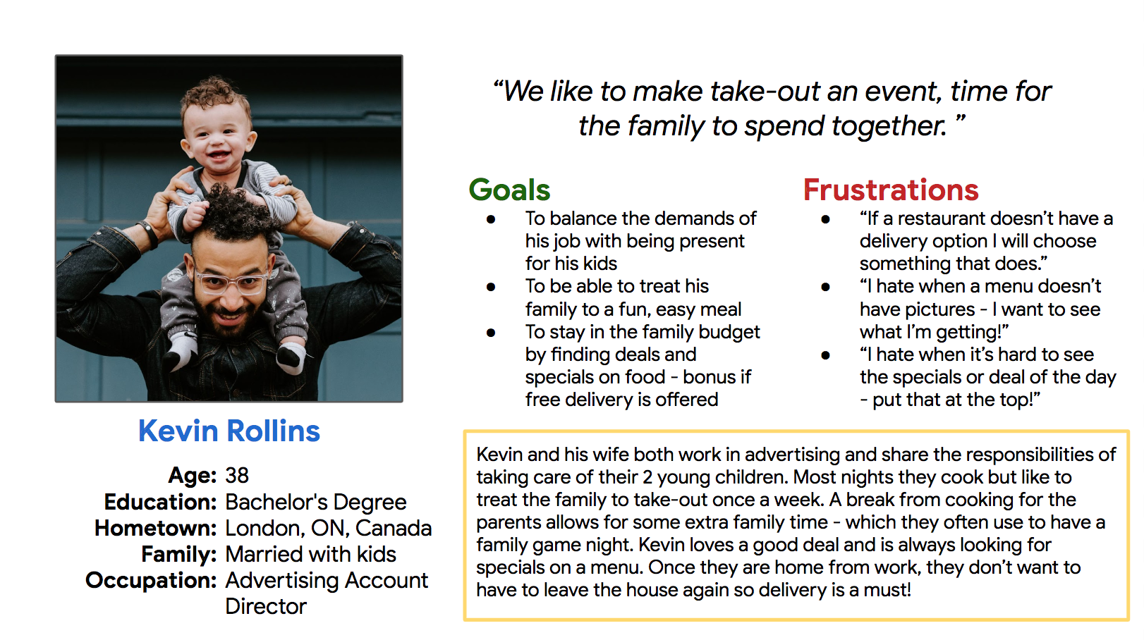
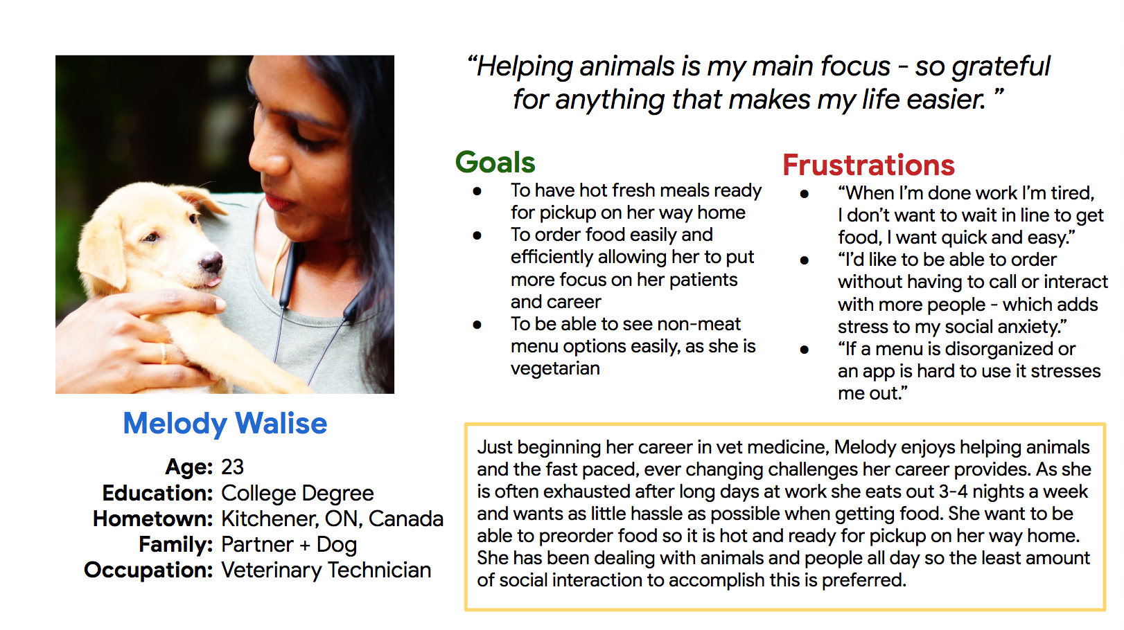
Although the target audience more broadly is people who enjoy tacos, when designing I specifically wanted to focus on people who would be too busy to cook and had hectic schedules - like those with young children or busy jobs. I decided to do this to design the app for those with the most things to juggle, which in turn will make it easier for all users.
The key challenge here was to create an equally easy and convenient user flow and ordering process for those who wanted delivery vs. those who wanted pick-up. I wanted to incorporate features that made both of these experiences better, such as a countdown to delivery and the ability to pre-order and decide what time to pickup food.

USER PERSONAS BASED ON RESEARCH TO BUILD EMPATHY WITH THE USER
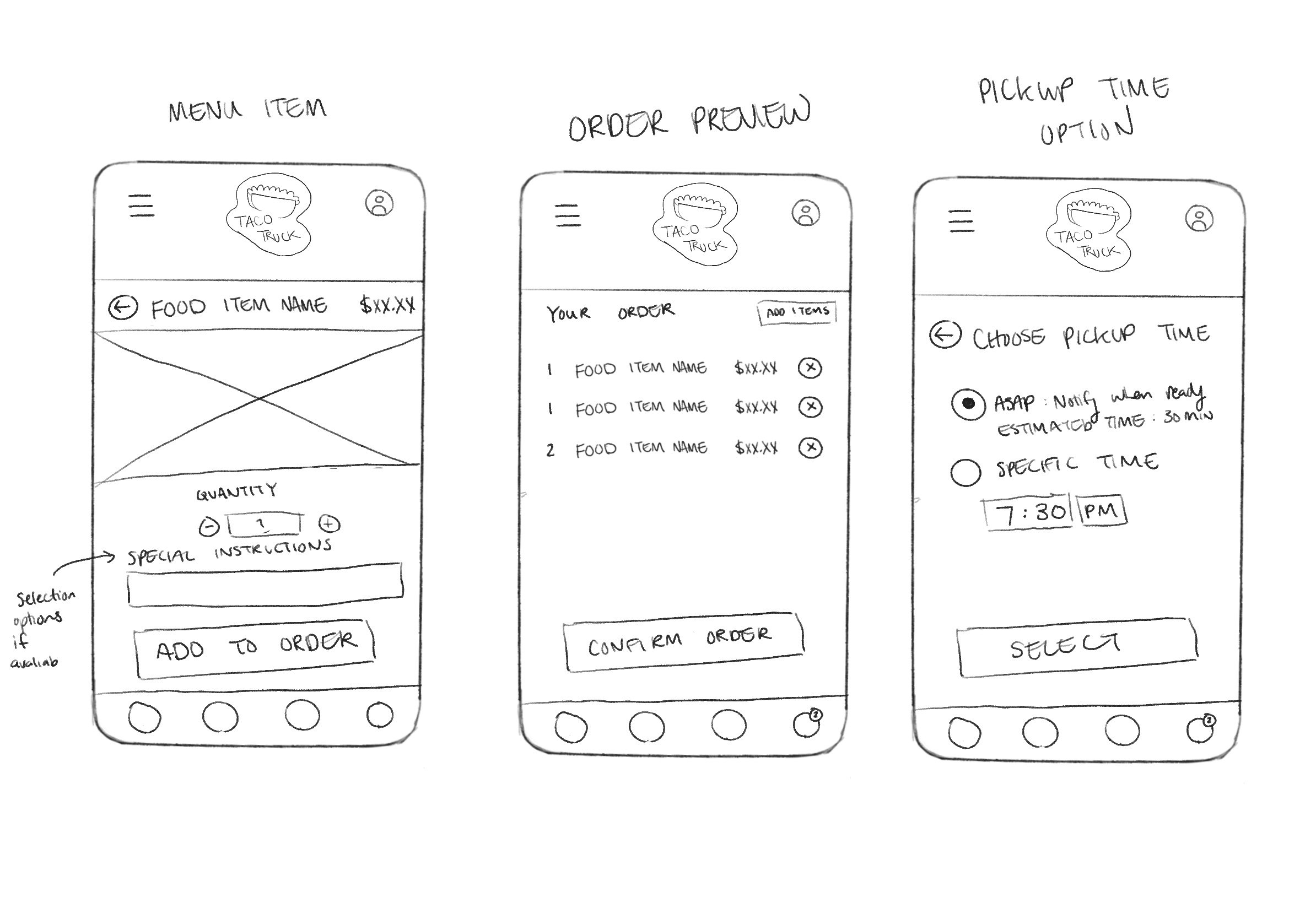
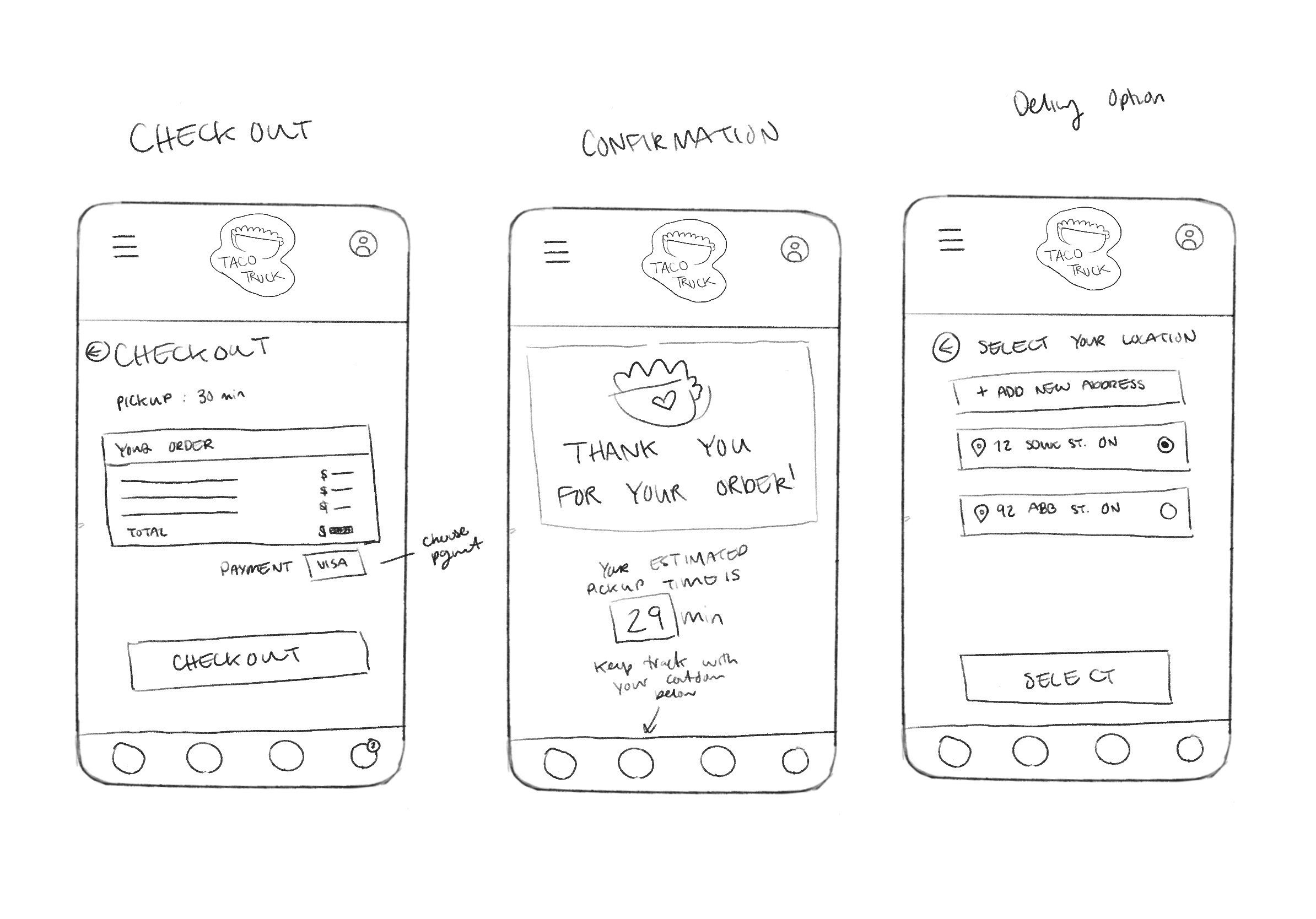
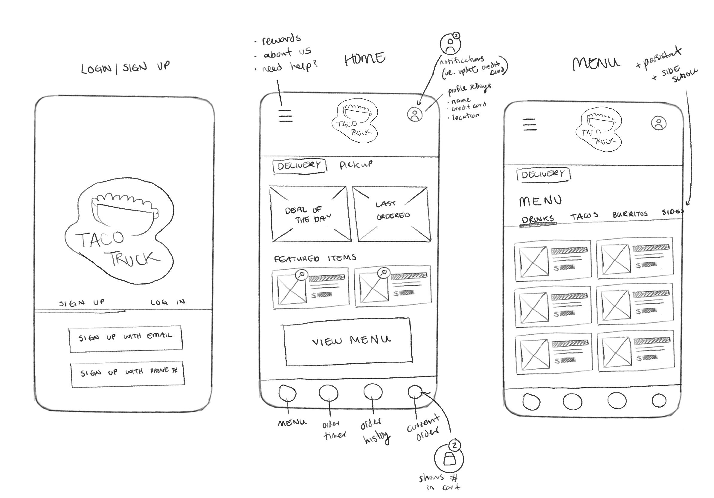
PAPER WIREFRAMING
I began the design process on paper to allow me to explore options for layout more quickly and organically than if I started digitally. It also allowed for me to work through how the app itself should work and how many pages were needed.
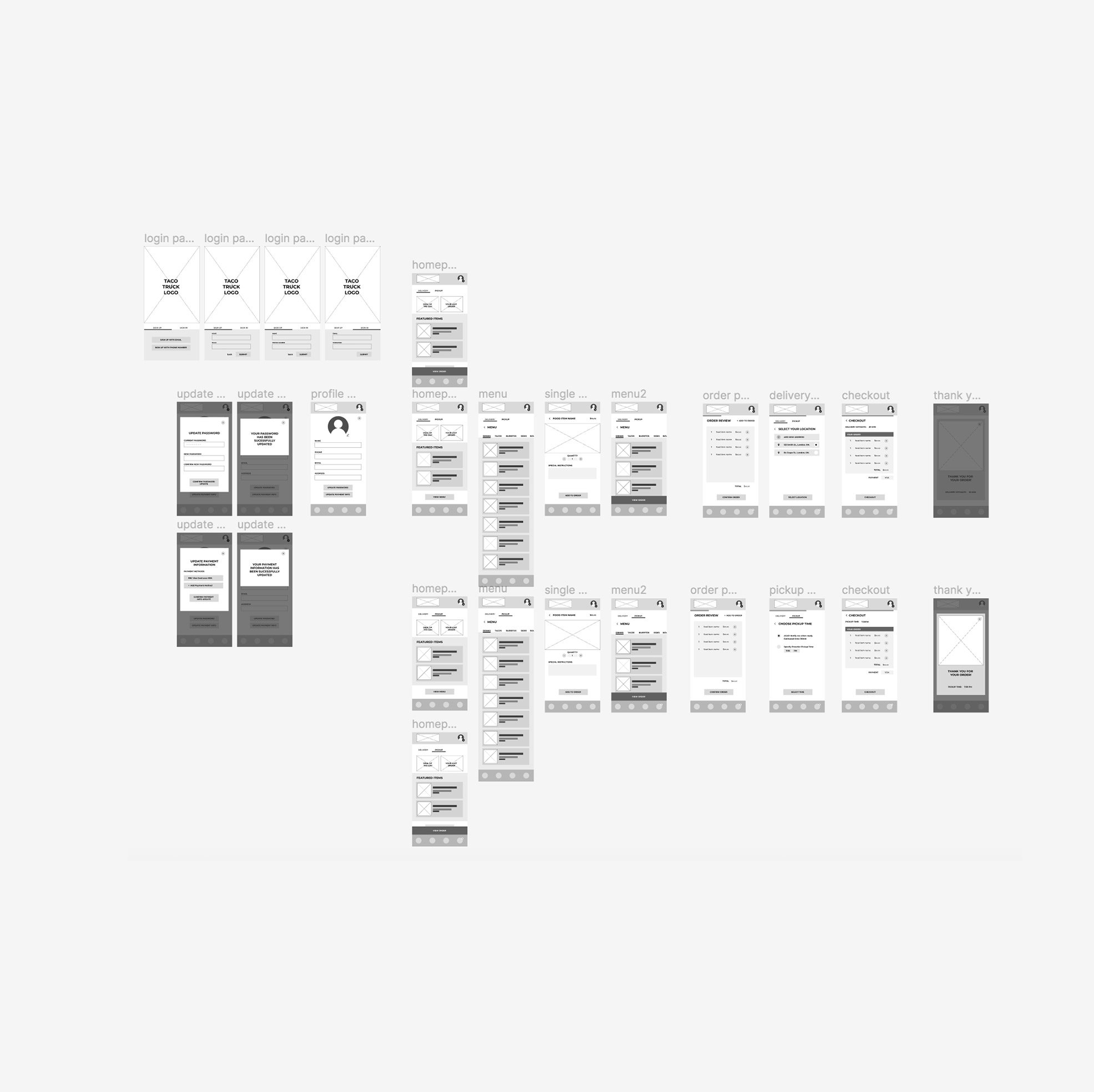
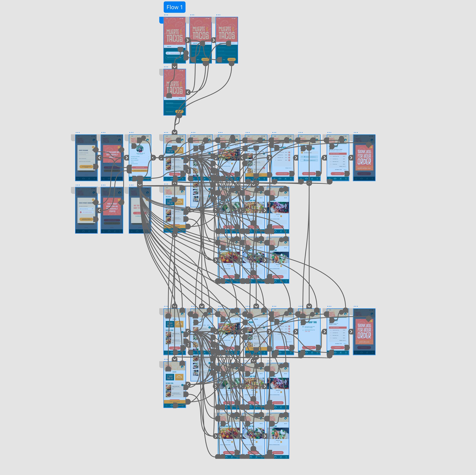
THE DESIGN PROCESS OF THE APP FROM WIREFRAME TO WORKING HIGH-FIDELITY PROTOTYPE


USABILITY STUDY FINDINGS
icon confusion: some users had difficulty understanding that the profile icon was also where settings were located so the icon was updated to include a settings gear.
colour contrast: some users found that there was not enough contrast with the colour of orange being used so I referenced the AIM colour tool and improved all colour contrast.
button styling: some users found the “visa” change payment button styling distracting as it was different than the other button types so it was changed to confirm to a pre established text link style.
PROJECT IMPACT & TAKEAWAY
I believe the main thing I learned from this project was the importance of doing proper and detailed research as well as getting user feedback to create an app that is accessible and equitable for as many users as possible. I also learned that UX design is an iterative process - the idea is just a beginning to be built on with teamwork and collaboration. I think the impact of this app in the real world would be to have made a product that allows many different types of users, with different needs to easily order tasty tacos in an efficient and enjoyable manner.
NEXT STEPS FOR Muerte & Tacos
To research adding additional features - such as a map tracker for delivery.
Developing an on-boarding flow for the app.
Larger user testing to see how people with various needs experience the app.

Project information
Project done for: Google UX Design Certification through Coursea
Year: 2022 Team: None
Skills used: UX design / IU design / research / branding / visual design / app design / user testing / prototyping / wireframing