
UX Design: web
Muerte & Tacos
/ responsive website design
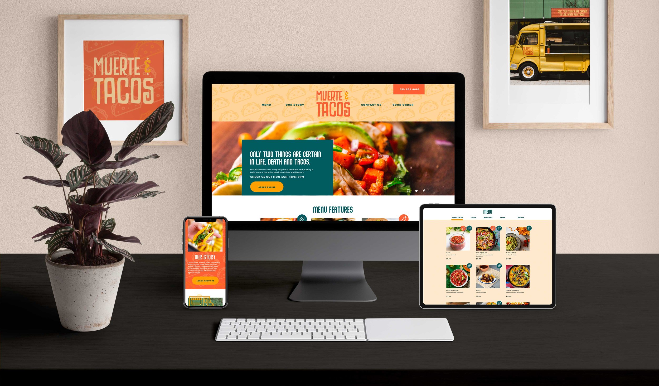
The challenge for this project was to design a responsive website. We had the choice to get a new prompt from a randomized generator, or continue with the same prompt we used in developing an app. I decided to continue to build on my previous project which was an ordering app for a fictional artisanal taco truck in London Ontario which I named Muerte & Tacos. I decided to create the website as a companion piece - an online menu and ordering system that also allowed users to learn more about the restaurant, as we all track the location of the taco truck itself.

THE PROBLEM & GOAL
The issue this website was aiming to solve is that young professionals and young families lack the time to prepare meals and want the option to order in or pickup food on the way home, in a timely and cost efficient manner. Many restaurant websites are out of date with pdf image only menus, which are both annoying and inaccessible.
The goal was to design an easy to use, eye catching website that allows users to order fresh meals for delivery or pick-up easily and quickly.
TARGET AUDIENCE & CHALLENGES
Although the target audience more broadly is people who enjoy tacos, when designing I specifically wanted to focus on people who would be too busy to cook and had hectic schedules - like those with young children or busy jobs. I decided to do this to design the app for those with the most things to juggle, which in turn will make it easier for all users.
The key challenge here was to create a menu that was live text, responsive and accessible to users regardless of the device used to access the website. I thought this was the perfect challenge for a project about responsive design as many restaurant websites - especially for smaller, independent businesses are inaccessible due to image only menus, poor scaling or forcing the user to download a pdf.

USER PERSONAS BASED ON RESEARCH TO BUILD EMPATHY WITH THE USER


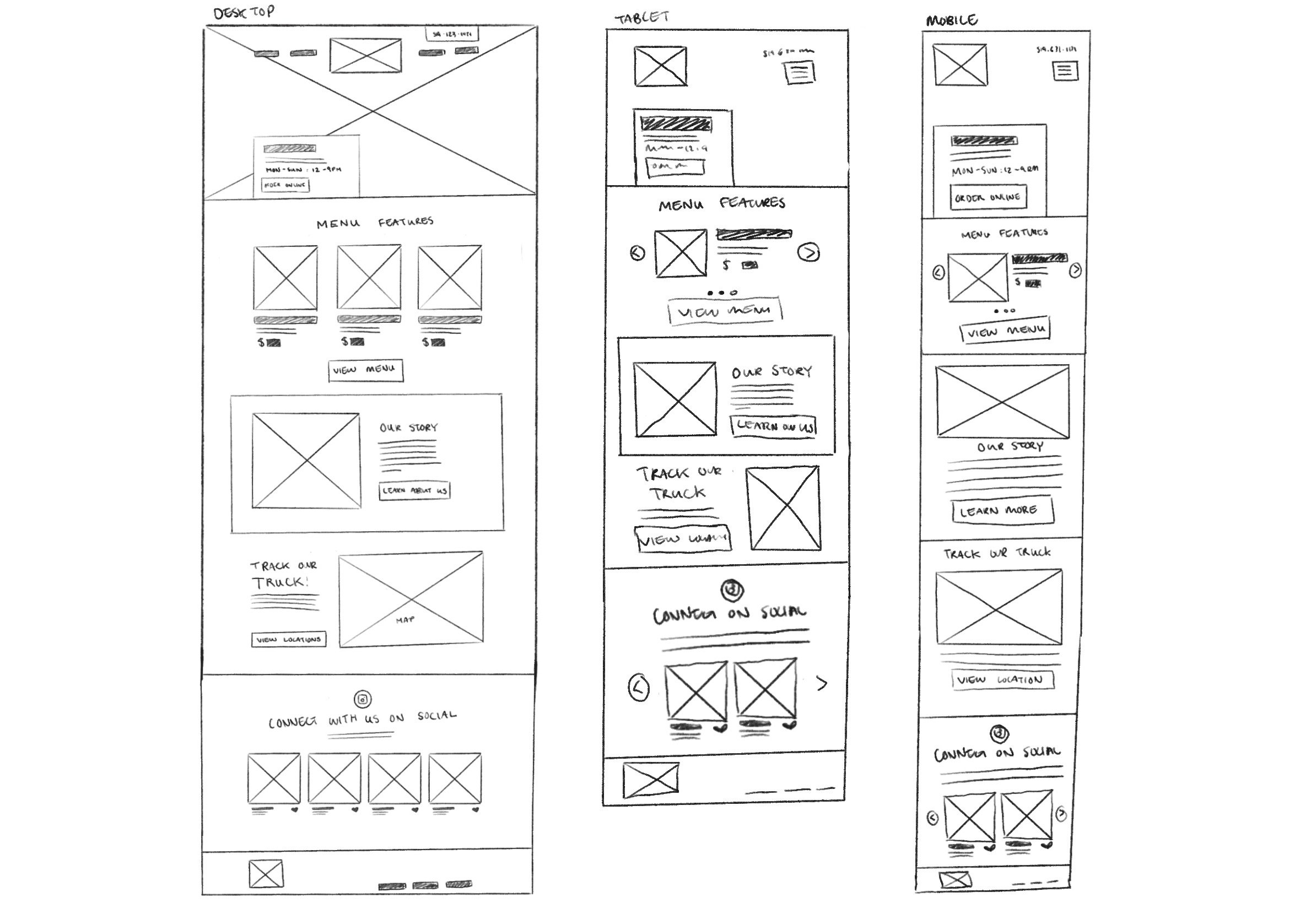
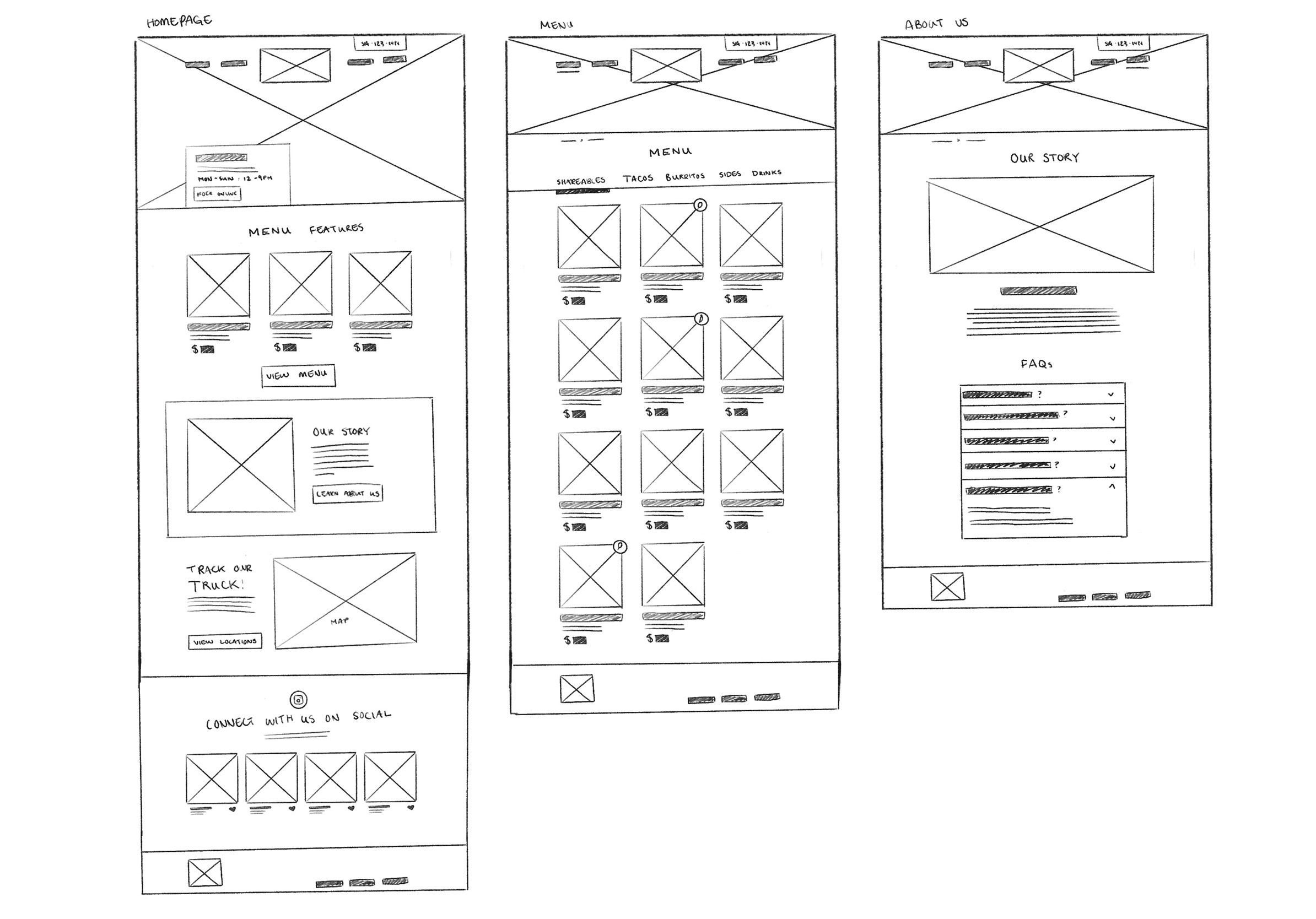
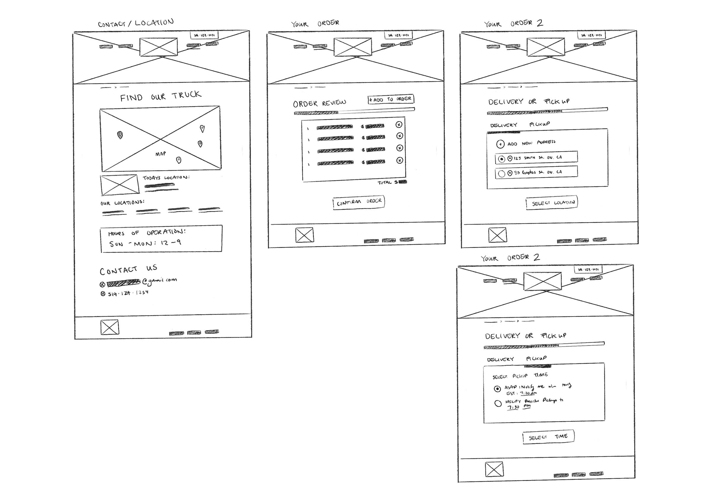
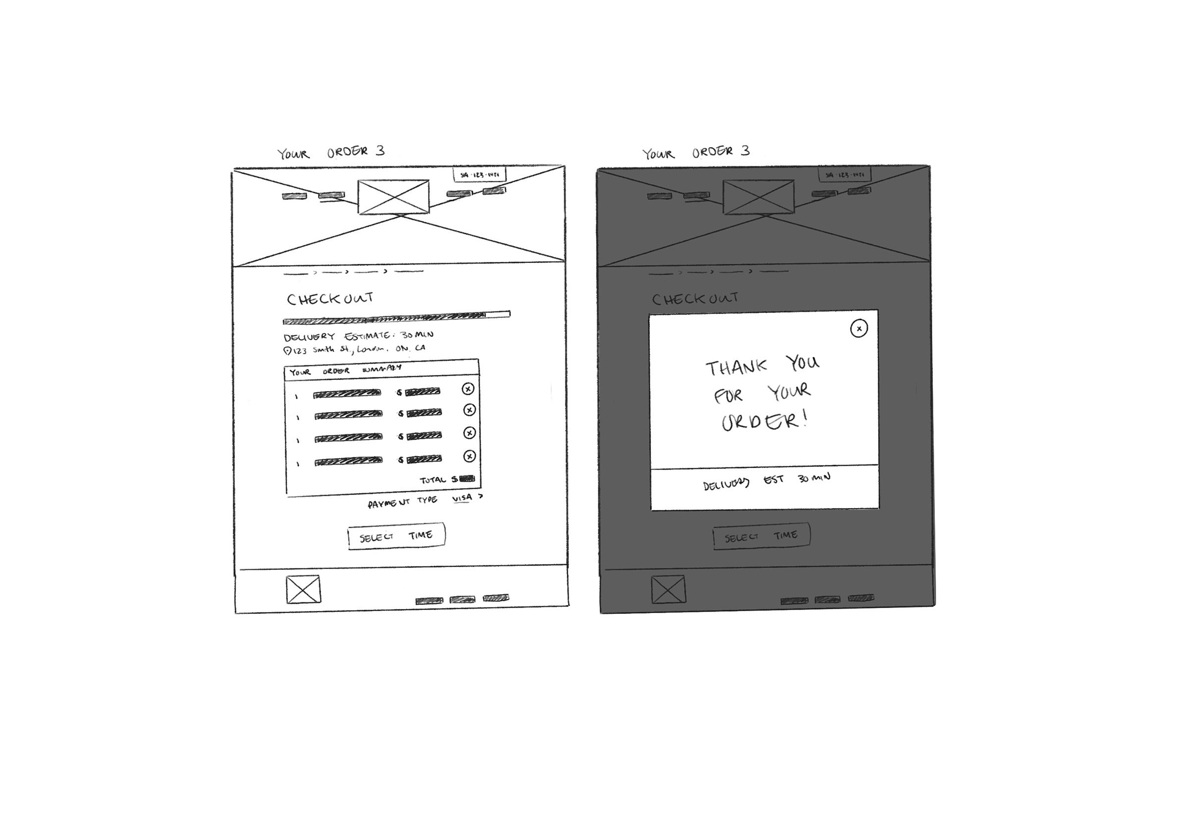
PAPER WIREFRAMING
I began the design process on paper to allow me to explore options for layout more quickly and organically than if I started digitally. It also allowed for me to work through how the website should restructure for different sizes and how many pages were needed overall.
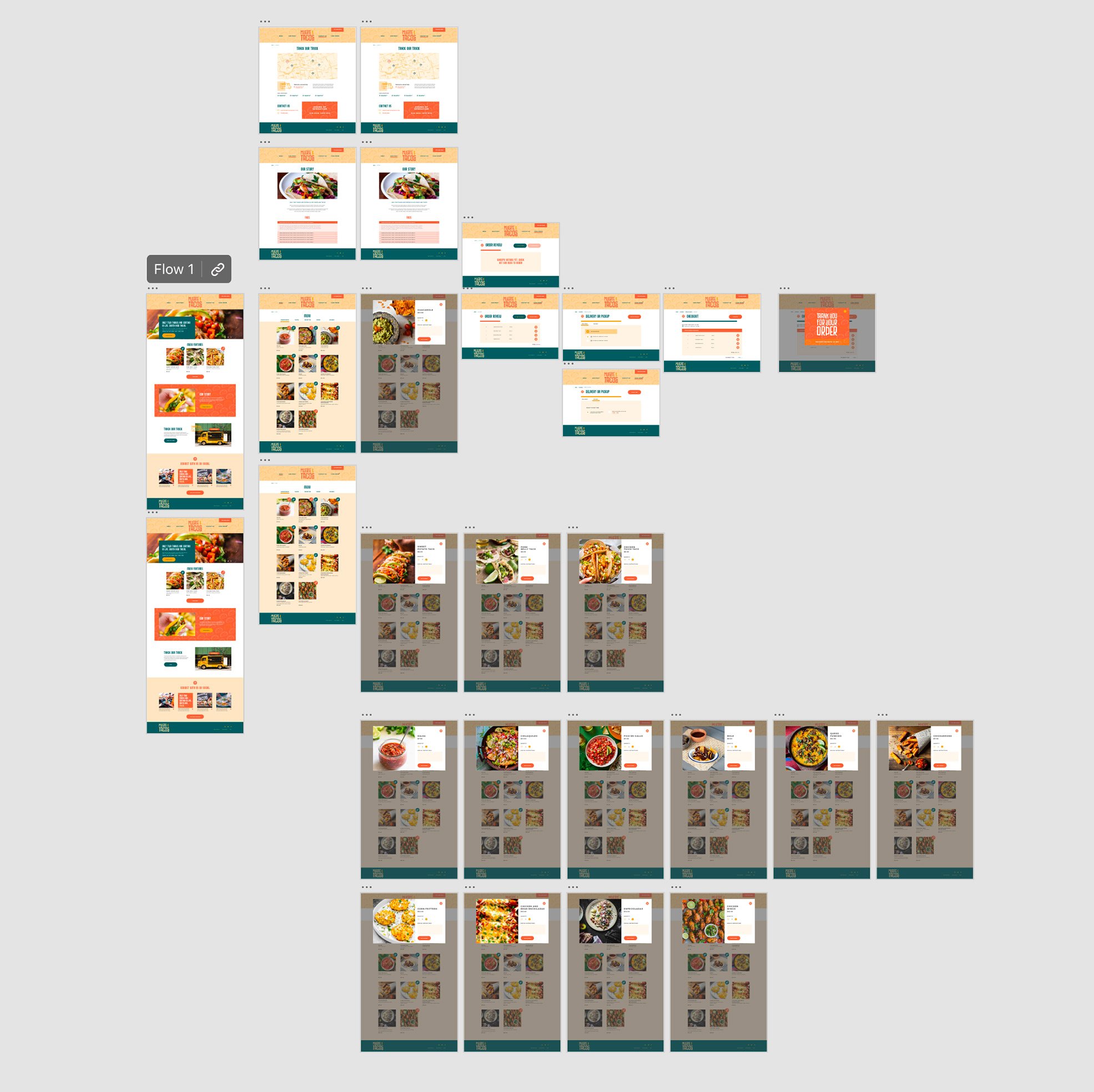
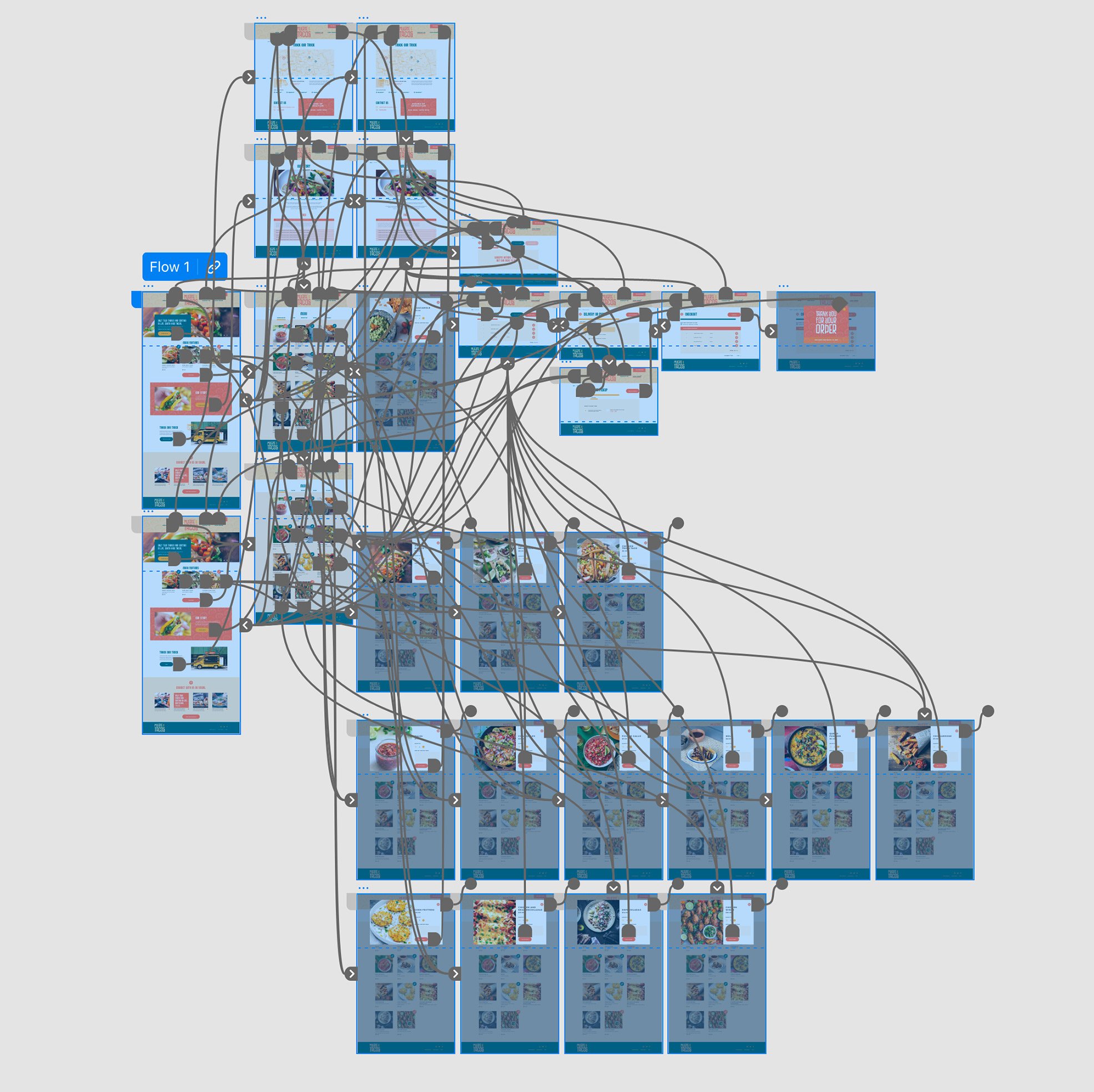
THE DESIGN PROCESS OF THE website FROM WIREFRAME TO WORKING HIGH-FIDELITY PROTOTYPE


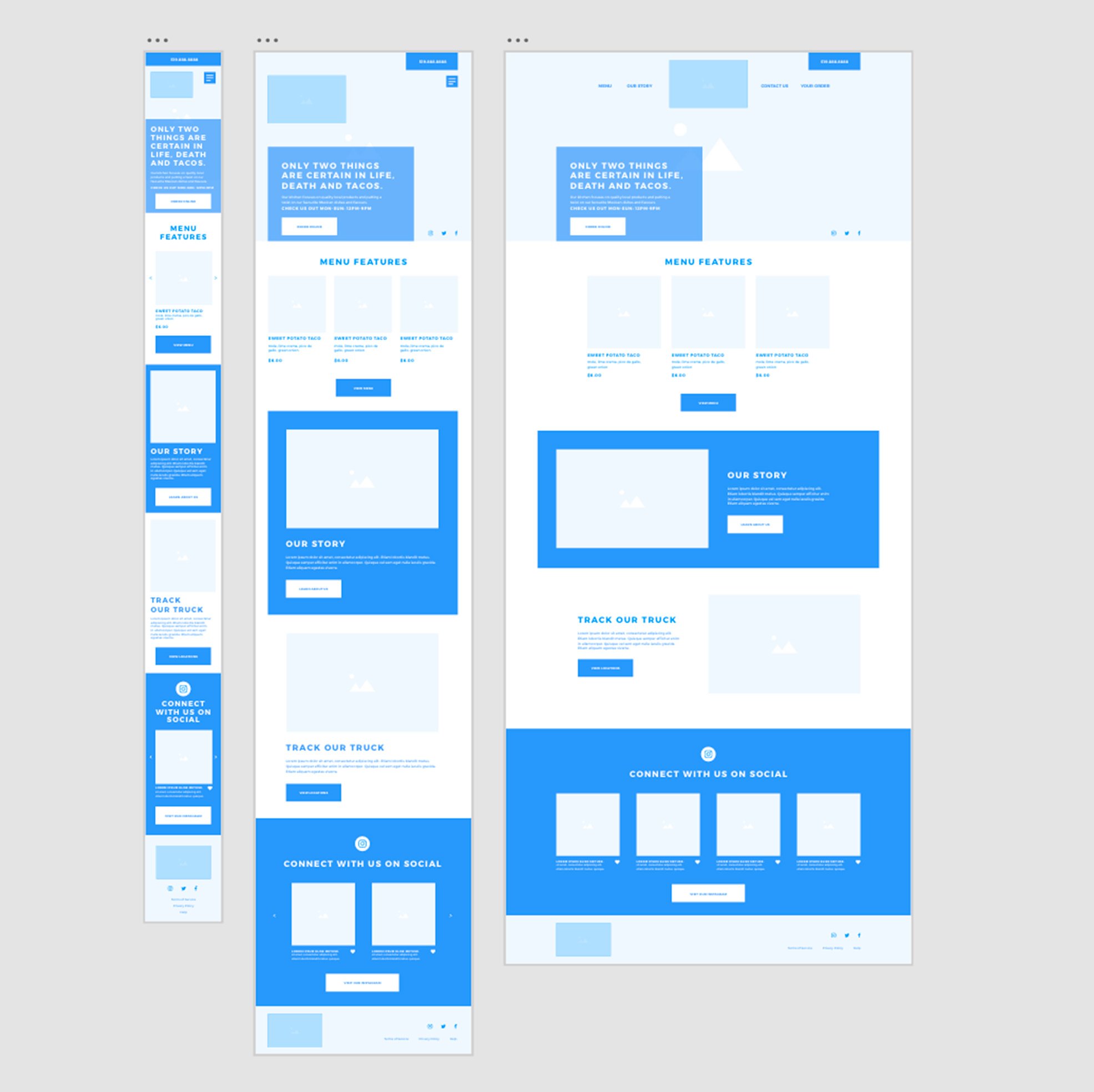
Responsive design
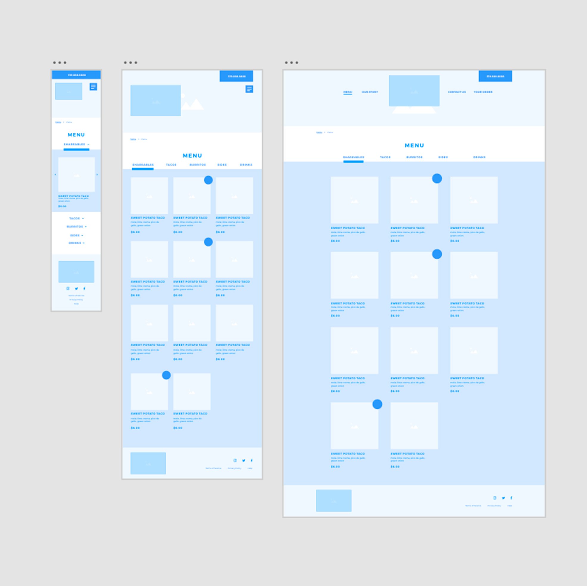
As with the paper wireframing stage, I continued to build out the website in various screen sizes to ensure the user experience would remain consistent across different platforms. As an example I have shown 2 of the most important pages of this design built out in mobile, tablet and laptop sizes, the homepage and the menu. As the first touchpoint on a website, it is extremely important to make the experience of the homepage is equal across devices.
The second page that I really wanted to focus on was the menu as that was one of the main pain points researched when it came to people using restaurant websites. I wanted to make sure that ti scaled in a way that was easy to use and accessible on any device.

USABILITY STUDY FINDINGS
button positioning: all users found the series of buttons on the checkout process were too far down the screen so they were moved higher to make sure they are always above the fold.
header size: some users found the header on internal pages was too large, they were shortened to reduce the amount of important content pushed further down the page.
pop-up positioning: some users found the menu item pop-ups to show up too low, so the prototype was changed to make sure they are above the fold. In a real app they would be centred within the user’s browser for ease of selection.
PROJECT IMPACT & TAKEAWAY
I believe the main thing I learned from this project is the importance of designing for multiple sizes of screens to create a fully responsive website that allows users have the same experience on all platforms. I think the impact of this website in the real world would be to have made a product that allows people to learn about Muerte & Tacos and order from their online menu in a stress free, easy and accessible way.
NEXT STEPS FOR MUERTE & TACOS
To research adding additional features - such as a map tracker for delivery.
Building out tertiary pages of the website - such as help, accessibility, terms of service etc. and get user feedback on those.
Larger user testing to see how people with various needs experience the app.

Project information
Project done for: Google UX Design Certification through Coursea
Year: 2022 Team: None
Skills used: UX design / IU design / research / branding / web design / visual design / user testing / prototyping / wireframing